Friday, 20 January 2012

Stage 4 Raised and structured surface textures

I found this really interesting, manipulating fabric, here are my examples:


Gathering

Folding

Pleating

Tucking

Tearing, fraying and slashing

Quilting

Raised Shapes

moulding

These examples would be another good way of experimenting with an image, when coming up with ideas.


Final Sample

For my final sample I used a drawing of a pumpkin that I did at Halloween last year. I thought that the lines in the drawing lends itself well to folding and gathering fabric.


I felt the image was fine as it was, but felt that if I repeated the image in different sizes then it would make it more interesting.


Here is the final sample using folding and pleats and a little gathering. I am pleased with the outcome. It would be interesting to do a drawing from the sample and see what images would come out of it.


Stage 3 - Applied fabric techniques

I tried a number of techniques, as I am new to some of these. Some worked out better then others, here are my examples:


I experimented with different types of machine sewn applique and cut-back applique. I tried water soluble fabrics which I loved. Trapping fabrics between layers of fabrics with bondaweb, putting objects in pockets of sheer fabrics, melting sheer fabric to another fabric using heat from an iron. I also tried using tyvex fabric, I found it quite difficult to control so I will have to experiment with it a little more if I want to use it in any of my work.


I found that while doing these experiments I enjoyed sewing machine applique, trapping fabrics and using the water soluble fabric. As I enjoyed using these techniques, I wanted to try and use them in my sample.


Sample


I am very pleased with this sample it came out just how I visualised it should. I trapped fragments of fabric behind a sheer fabric to give the background texture, I then made the green pineapple shapes with a sewing machine and water soluble fabric and hand sowed them on using a thread the same shade of green. I then appliqued a sheer fabric in strips over the top with frayed edges to give more texture with a little sewing lines to give even more texture. The whole piece is based on three of my drawings.

Part 3 Stage 1 & 2

Stage 1
Firstly I began to sort out all my fabrics, I have been meaning to do this for a long time as they were in a jumble, so I arranged them in colour order and then bagged them up. This was certainly worth the effort as I can now find the colour that I need and I only have to go through one bag to find the type of fabric I want to use. I can also see what colours I am lacking so if I am out and about I can keep an eye out for these.


 Stage 2
I looked through my sketch book and chose the 6 drawings, but narrowed it down to 2 drawings that I wanted to develop for my 2 final samples. I then develop my first drawing further to make it more interesting to work with.


My original drawing of a pineapple.


 Developing the image using different techniques:


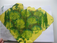
I loved the colours and the repetitive shapes in the image. I used a simplified technique of mono printing by rolling paint onto glass, scratching into the paint and then laying the paper onto the glass and rubbing lightly on the back, pulling the paper off and once dry adding colour to that. I also used paper collage. I am very pleased with how these came out.

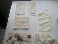
I then did some overlays. I do not think they were overly successful but I feel that I got the idea of using the fabric like this to see what works together and how fabric react when being layered, as some fabrics change their shade when they are against others.


I feel that the colour aspect of these collages, works best against my drawing.


Part 3 Creating Shapes and three dimensional forms

Finally I have got around to updating my Blog, I had good intentions of doing this regularly but find that I don't and end up doing it when the assignment is complete and ready for sending off to be assessed.
I have enjoyed this assignment more than I thought I would, not being a big fan of sewing, but I found that I enjoy the manipulation of fabric and experimenting with all the different techniques.


Thursday, 10 November 2011

Project 5 stage 3 & 4


Project 5 Stage 3 & 4


Stage 3


By this point I had decided what the design would look like, but I was still unsure of the colour combination that I was going to use or what type of repeat pattern I was going to do with the lino block that I had designed, so I tried a couple of different designs. I first tried layers of complimentary colours, reds and orange and blues and greens and them red, brown and blues. I felt that the red, brown and blue worked better for this sample as, apart from the blue it was the colours that were in my objects that I had drawn. Then I did two different repeat design that i thought worked well with my block print. The first a random, overlaying repeat and then a diamond pattern repeat. They both work well but again for this sample I like the overlaying of the print, as it made interesting patterns when it was overlaid and gave the fabric depth and movement.
Here is my approx 40cm x40cm samples:
Stage 4


Here is my final design. It has 3 different layers of colours rolled on in blocks in different directions horizontally and vertically, I then printed the lino block in two different colours over layering where I felt it worked, I added an extra layer to the design of shading on selected part of the print in Markel paint stick to add to the depth and movement. I am really pleased with it, and feel that I have achieved movement and depth. I love the colours that I chose and feel that they work well together, but I think that any colour combination that works together will work and would give the piece a different feel and mood. I am happy with my chose of fabric, calico. I feel that the weight and texture work well with my design and that a shiny, lightweight or textured fabric would have detracted from the design or it would have lost the texture that I was looking for from the rolled background. I feel that the design works well as the shapes and repeat of the design is simple, which allowed me to overlay the image and colour without it looking to messy.


Reflection from Assignment 2


I really enjoyed this assignment. I felt a little bogged down at the beginning as sewing and embroidery is not my strong point and I do not enjoy it as much as other parts of textiles, but I do think I will use it in some parts of my design work in future. I enjoyed all the drawing, and could have spent hours doing that as well as the printing, I had forgotten how much I enjoyed to do this and would like to do more in the future. I feel that my final print was very successful and that I manage to work thought the design process with ease. My only limitation was finding the time to do it. I did not do much painting on fabric and I did not do the machine embroidery on water soluble fabrics because I ran out of time, but I hope to get round to trying this out. I am looking forward to the next assignment even thought there is more sewing!!

Project 5

Project 5 Painting and printing
Stage 1 & 2
I spent an hour looking though all my fabric and deciding which were best fitted to my designs that I was planning on doing. Most of the fabrics were plain, tones of cream, grey and green. I also chose black and red. I chose all sorts of fabric types from muslin, hessian, calico and cottons to see what happened when they were printed on.

I then chose 4 designs that I felt worked and then looked at them to come up with a design that worked well on fabric.  I first chose the fern design and felt that a subtle print would work well for this design. I have two different designs for this, a block print and a stencil. I also like the geometric design with the line, circles and diamonds. I was looking through an African textile book that I got out of the library and this gave me a few ideas that I could use for the colours and design of this design. I loved the shades of browns and blues, and the respective block prints.


This lead me to design a block print out of lino using the shapes, here are some of the practicing:


I feel that some fabrics worked better than other, hessian was difficult to print on and muslin gave a grainy effect, the shiny fabric worked well, apart from it is on black so it is hard to see the design. The green on green fern design was far too subtle and I felt that I needed to take more time on this design to make it work. I felt that the geometric design was started to work how I wanted it to but it was still missing something, so I looked through Ruth Issett’s book again and realised that it was layers in colour that I was missing and went back and looked at my practice paper and fabric and design work and came up with a new idea using the lino blocks and roller and bits that I felt work from all of these.