I have finally got round to updating my blog, I will have to get into the habit of doing this more regularly.
Stage 3 recording colour accurately – exercise 3 & 4
I found this image in a magazine and loved the bright colours. I tried not to make it look like the image, but as I mix the colours and identified each colour and put it down the picture developed and does look like the image.
Again, the image does look very similar, I identified all the colours, and I found the red hardest to mix.
Stage 4 – Colour moods and themes exercises 1& 2
I really found these exercises fun. I really tried hard to go with my feeling of the colour of the word not what the stereotype is.
My Mood board and book was autumn colours. I chose these colours as I found a photo of my husband walking though the wood at the start of autumn. Even thought the photo was still very green, I selected images from magazines that were autumn and autumn colours and put together a mood board, colour bag and mixed some autumn colours. I love these colours; they are so rich, warm and comforting. I would like to do some sketch book work if autumn related colours and images so that I can use them for future projects.
I then found some time to look at the impressionist.
I looked at Degas, Seaut and Monet. I started with degas as I loved the way he uses paint and pastel together. He was very experimental with colour, texture and composition. He wasn’t scared to just stick a piece of paper over part of the work that didn’t work and change it. He used colour beautifully to draw your eye into different parts of the image. His composition of the painting of dancers and the nudes of women bathing and washing are so interesting, some are only partly on the page, using them to frame the subject. Seaut later landscapes are very interesting and beautiful. He used pointillism to create his paintings but he also played with the composition too. If he wanted an upbeat, happy picture then he would use curves going up and happy colours. Monet has always been a big favourite of mine. I visited Giverny a number of years ago where I visited his garden and I feel that he managed to make the painting even more beautiful than the place, he captured the mood of the place too in his work. I best bit of Monet work is the brush strokes, these give the picture life and the colours.
I saw a recent series on BBC 1 about the impressionist that was very interesting and informative.
I did a few small studies of a couple of the images I enjoyed, looking at the colour, and marks that was made. I also did a picture not long ago of a photo that I took at Giverny and tried to give it a Monet feel.
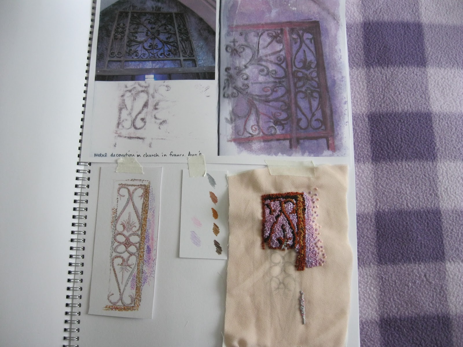
Stage 5 & 6
I did the stitch samples. I found that depending on the amount of colour block of red it push the blue to the background. If the colours are next to each other with only small amounts of colour the colour mixes together. If there is a lot of background between (I used black) it stays true to the colour. Also the black background makes the colour stand out. This reminded me of an artist I looked at while doing a short drawing and painting evening course not long ago, Juan Sanchez Cotan. His still life’s always had a black background. He did this as he was interested in the relationship between the objects and the use of light and shadow. I also think that this help to make the colours stand out and true so you could get more of the impression the relationship between objects. I did a study of the painting Quince, cabbage, melon and cucumber, 1602.
Review of assignment 2
1, Yes I feel that I could mix and match colours accurately. I found reds and orange a little more difficult to mix.
2, I feel that I could use colour expressively. Although I found some were more difficult than others, and some were very similar. The hardest part was to express the colour that I was feeling not the stereotype.
3. I do look at the colour a bit more now and analysis what the colour is and what shade it is.
4. I did not use gouache paints, I used watercolours and acrylics as the gouache paints that I had did not have all the colours that I wanted to use. I prefer acrylics. I found watercolours paints were good for expressing moods like sad, dull, slow static moods. Were Acrylic were more bold, happy, active.
5, I think the exercise in stage 5 were successful. I think on the whole this stage was successful. The first one I was a little nervous. I enjoyed using the French knot stitch will defiantly use it again in my work. It has a lovely tactile quality.
6, I would like to spend some more time looking a colour.
Research Point – Textile piece
This piece of textiles was given to my mum before I was born to bring me home from hospital by my Nanny (Dads Mum). She passed away not long before I was born, so it has great sentimental value. It has only been used by me. Mum has now passed it to me, but I have not used it for any of my children, with fear of it being ruined. It is approximately 35 years old. The bag is white, rectangular in shape (68cm x 37cm). It has frill/ribbon edging. The fabric is polyester/ manmade fibre and polyester filling. It was made on a machine; I know this as it all looks too symmetrical. The purpose is for a baby to keep warm. I was the last to use the bag. As the bag is white it can be used by boy or girl. This piece is very sentimental to me, it is very pretty, and I love the pattern of the fabric and the frilly edges. It is very simple in design. The piece does look a little dated now it looks very 70’s.
Textile exhibition ‘To boldly sew’
I went to this exhibition, it wasn’t as big as I thought it was going to be and I was not allowed to take photos. There were lots of interesting pieces. I was most surprised that the stitches used were very simple. A couple of artists that stool out were Sue Munday, Rosalind woodhead and Alison Milner-Gulland. A could of ideas that I liked were: using photos as part of texture, watercolour paints on fragmented paper to give delicate feel. 3D textile a twisted sculpture and putting the textiles work onto a canvas.
Project 4 Developing design ideas
Stage 1 introduction and preparation.
I have found doing this exercise that the squares or lines that were on a diagonal gave more movement and when they were straight they had a more static feel.


