Stage 1 - Preparation
Setting up the frame
The first time I set up the frame I did it wrong and had to unwind it and do it again. It took a while the first time but I managed it.
Stage 2 - Basic tapestry weaving techniques
Here I have experimented with all the different knots and types of weaves.
Stage 3 experimenting with different materials
In this sample I chose the theme Autumn Leaves. I selected colours that reminded me of autumn leaves and unusual material to weave with that gave the crispness of dried Autumn leaves. I experimented with different techniques.
In this second sample I chose a couple of techniques that I felt worked best and then tried to get the feeling of movement into the sample.
I feel this sample came out well and has a very tactile quality to it. I did make a little mistake with the weave in the bottom half, but I do not think it detracts from what I was trying to achieve.
Stage 4 - Developing design ideas into weaving
Sample 1
I started with a photo of frost on a black bag and did a small sketch trying to get the right colours and feeling of the photo. I then did a couple of windings with the yarns that I had. I practised with different materials and techniques to make sure I got the feel I wanted and the right material.
Here I put together a pattern to work from. The first design worked out to be too complicated and when I started to weave it, it did not flow well. So I redesigned the pattern being a little move freer taking a small area of the drawing and this design worked better.
Here is the finished sample. I feel it worked well and I feel it is a good interpretation of my drawing.
A close up of the an area of my weave.
Sample 2
The second sample, I stared off with a mood board using the word 'Underwater'. I found images that said underwater to me and then looked at my materials and matched colours and textures with the photos. I found that the mood board had to different feels the coral garden and the feelings and blues of being under water. After doing my sample from this mood board I realised that I was not happy with it. It could have been better and if I had more time I would have liked to have done another one that was more blue with movement of the sea and not have put the coral on it. I feel if I had come up with a mood board like that then the sample would have been more successfully.
Workings for sample (a) I took a photo and then took texture and colours and tried to put them together to give the feel of a coral garden under the sea.

Sample (a)
Close up details of Sample (a)
Even though I felt that parts of this weave worked and the colours and the textures put together did give the feeling of a coral garden under the sea, I did not feel that it gave the feeling of the word underwater. I feel that I got a bit distracted with trying to use brighter colours. So I decided that I needed to do another sample.
Here is the workings for sample (b). I had a good think of what underwater meant to me. I have done a lot of snorkling in the past and as a child spent a lot of time down the beach and especially in the sea, under the water swimming around. I feel that it is quiet, peaceful under the water and when you are at the bottom looking up it has a feeling of being in a big cathedral. So I tried to put these elements into the sample. I designed it to be in the shape of a stain glass window to give it that grand church feeling. I put the dark blue at the bottom in a plain weave so to give the feeling of depth and height and I added to the wool a blue sparkly yarn to break it up as I got to the lighter blue, but also to give the feeling of light hitting the dark depths of the sea. then I weaved a patten of moving water that has the light hitting it, to give a bit of movement to it as water is never static. Then over the top of the weave I added, using a bamboo fibre that has not been woven into a yarn, lines to again break up the flat weave and to give the impression of light shining thought the water and I used beads to add a little more interest and texture. These lines also added to the church stain glass window feel that I wanedt to achieve.
Sample (b)
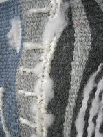
Detail of the bamboo fibre on the weave. I choose the bamboo fibre because of it shiny quality.
I am happier with sample (b), it has the feeling of underwater that I wanted to achieve. I do feel that I work better from developing an image like I did in sample 1 than I did with the mood board. One thing that I didn't do in sample 2, was to use a different yarn for my warp. I didn't do this as I didn't feel that the designs that I was using needed this, so I quickly did a couple of small weaves on a card frame.
I feel that some samples are stronger than overs but overall assignment 4 went well, I enjoyed it and would definitely like to do some more in the future.


No comments:
Post a Comment